First Design
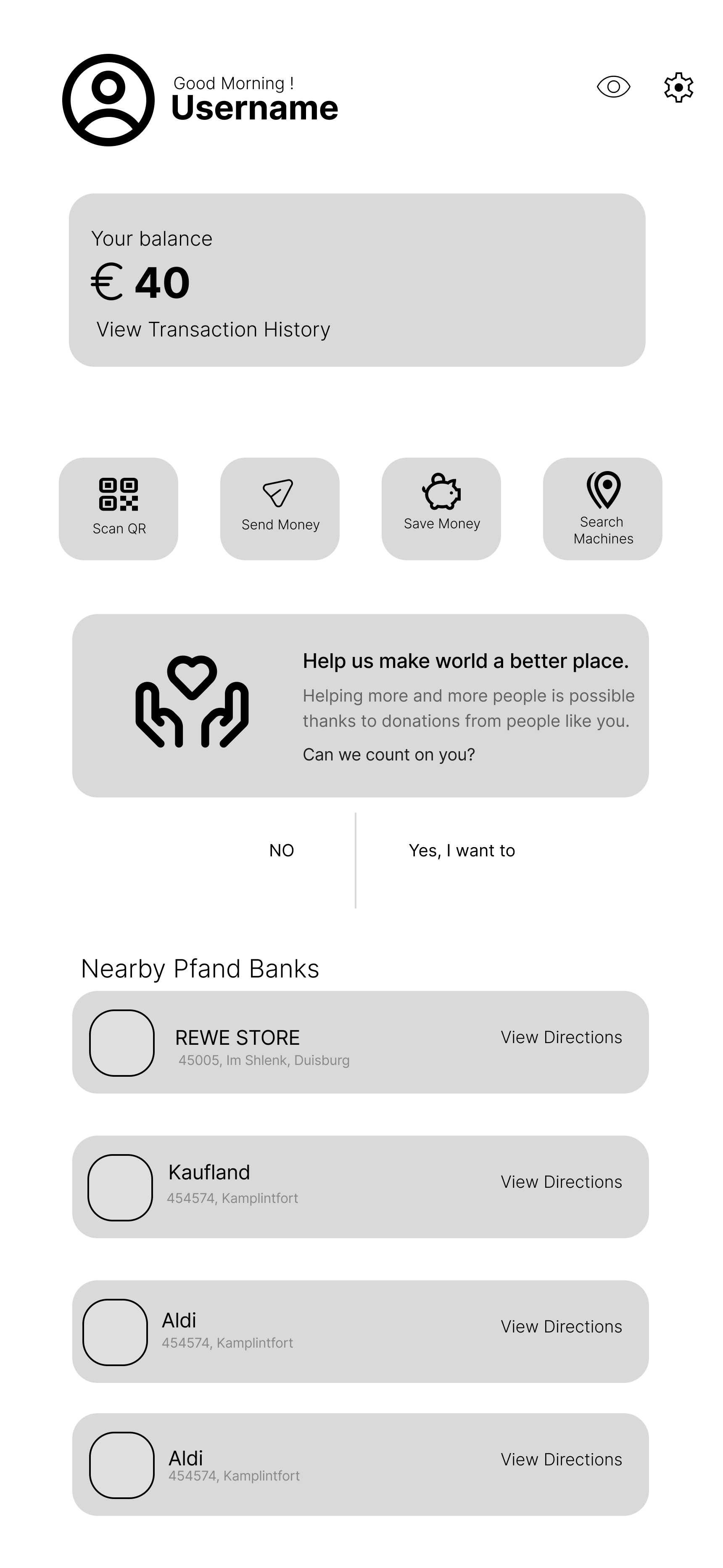
A fintech mobile app that digitises Germany's bottle deposit system, replacing lost paper receipts with seamless digital payouts, smart savings, and effortless charitable giving.
Moved from India to Germany and discovered the Pfand system
Saw people on streets collecting bottles. Every cent mattered to them
Inside supermarkets, shoppers crumpled, forgot, or lost receipts and walked away
People collecting bottles need the money. Shoppers returning bottles need a better experience
One product could bridge both. That became PfandBank
Every refund is income.
They need the money,
not a better app.
Lose receipts daily.
Want to help, but have
no way to act on it.
Design a better experience for the people returning bottles, and build donation into the core flow so the value they are discarding reaches those who need it most.
Better UX for one group creates impact for the other. Both sides win through the same product. That idea became PfandBank.
Users lose paper Pfandbon receipts before they can redeem them, literally throwing away money they earned by recycling.
First the machine, then the cashier. This two-step process wastes time and discourages people from recycling.
Cash at the counter is the only option. No digital transfer, no saving, no donating. For the users who would gladly redirect their refund to someone in need, this lack of choice means the intention never becomes action.
I used the UN SDGs to evaluate every feature. If it did not serve at least one goal, it did not earn a place in the product.
Can we create a frictionless path for users to redirect refunds to those in need? This is the bridge between the two groups from my personal story.
Can everyday recycling contribute, even in small ways, to food security?
Can a better user experience actually increase return rates and reduce waste?
Can reducing even a fraction of unmanaged plastic waste help protect marine ecosystems?
Reached eco-conscious consumers, professionals, families, and budget shoppers across Germany.
Deep dives into motivation and behaviour around bottle returns.
Research at a Glance
Users want choice, not just a digital receipt replacing paper.
Many wanted to donate refunds but had zero infrastructure to act on it.
Finding a working, nearby Pfand machine was a real barrier for users.
Research confirmed what I'd observed on the streets but added a crucial layer: the shoppers themselves wanted to help. They weren't indifferent to the people collecting bottles. They simply had no way to act within the existing system.
Make the return experience so seamless that users naturally engage with all their options, including the option to donate.

“I recycle religiously, but I lose the receipt half the time. The system punishes you for doing the right thing.”
| Stage | Action | Goal | Emotion | Pain Point | Opportunity |
|---|---|---|---|---|---|
| 01Collects bottles | Gathers bottles over the week | Return on next trip | Neutral | No deposit visibility No tracking | Pre-visit estimate → Estimate |
| 02Finds machine | Travels to supermarket | Find working machine | Uncertain | Machine broken Availability | Real-time locator → Locator |
| 03Returns bottles | Feeds bottles, gets paper receipt | Get refund quickly | Impatient | Long queues Time waste | QR scan receipt → Digital Receipt |
| 04Redeems receipt | Goes to cashier for cash | No-hassle money | Annoyed | Receipt lost Lost money | Auto e-wallet deposit → Auto Deposit |
| 05Uses refund | Spends cash in-store only | Use refund meaningfully | Limited | No choice No flexibility | Save, donate, transfer → Multiple Options |
Every pain point traces back to the paper receipt. Remove it and the biggest friction disappears.
When users can save, donate, or transfer, they return more bottles and engage more deeply.
Tiny refunds feel meaningless alone. But accumulated in saving pots with interest, they become meaningful.
Every feature connects directly to a validated user insight. No feature exists without a reason.
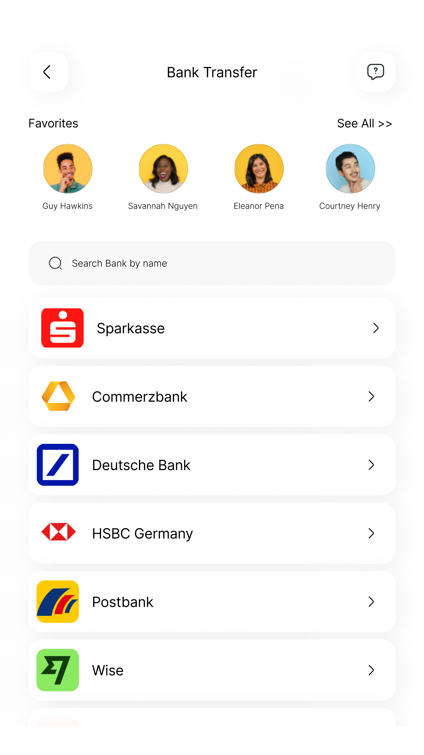
Bank transfer, e-wallet, saving pots, and donation, all from a single refund flow.
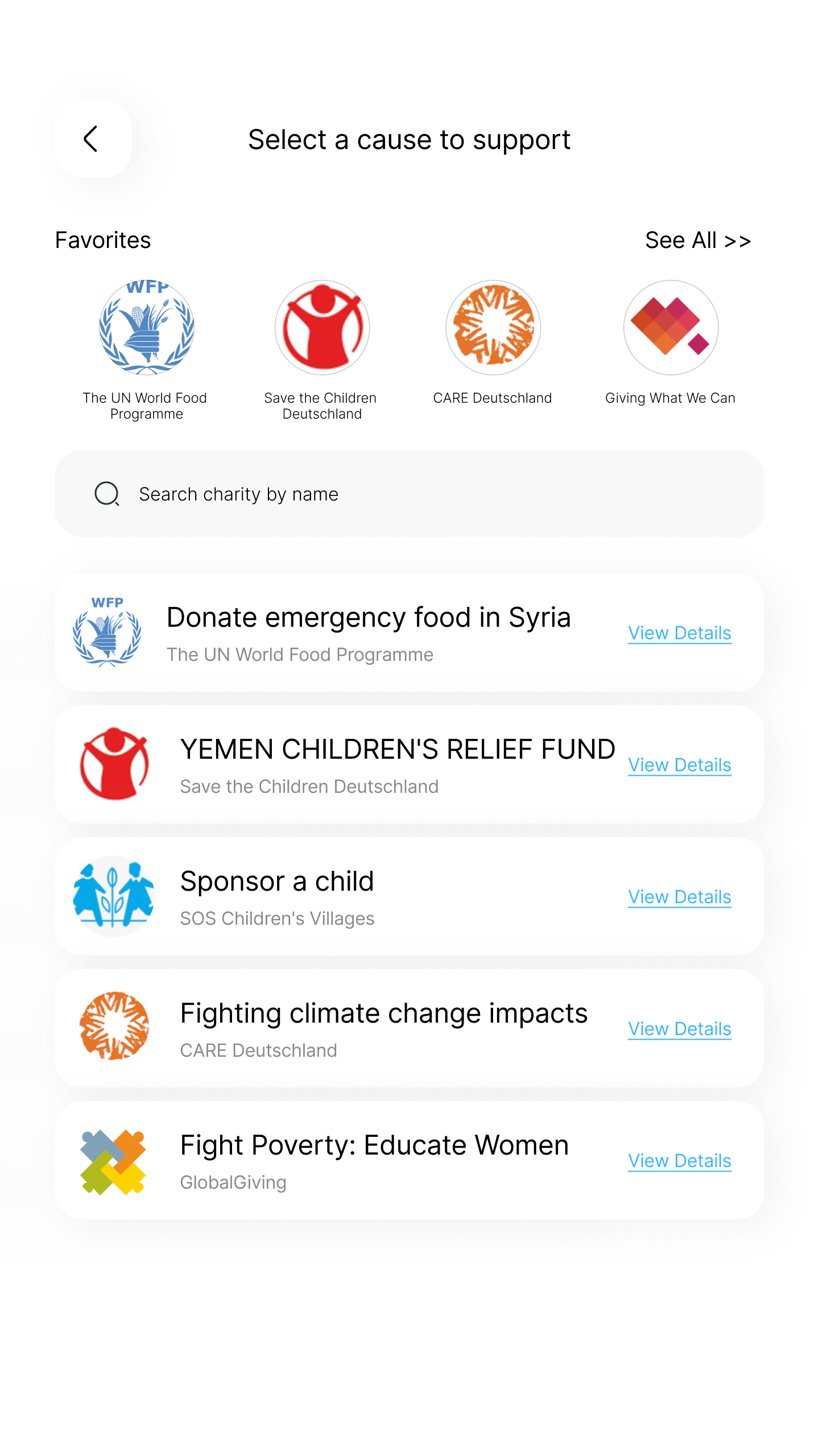
Browse charities, pick a payment method, and share your donation to inspire others.
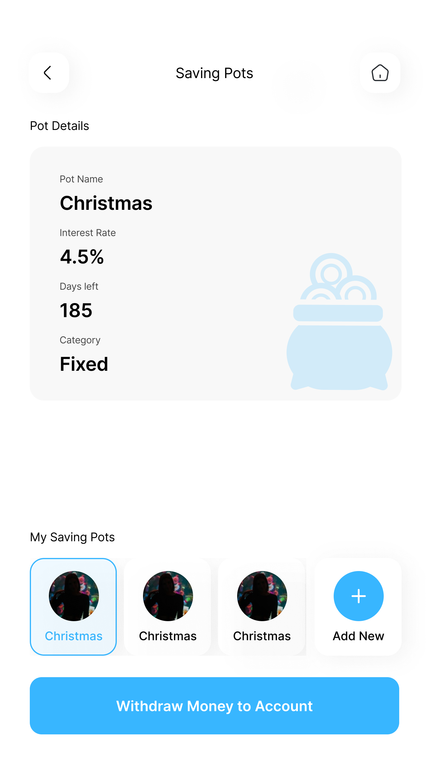
Fixed and flexible pots with interest that turn small refunds into real savings over time.
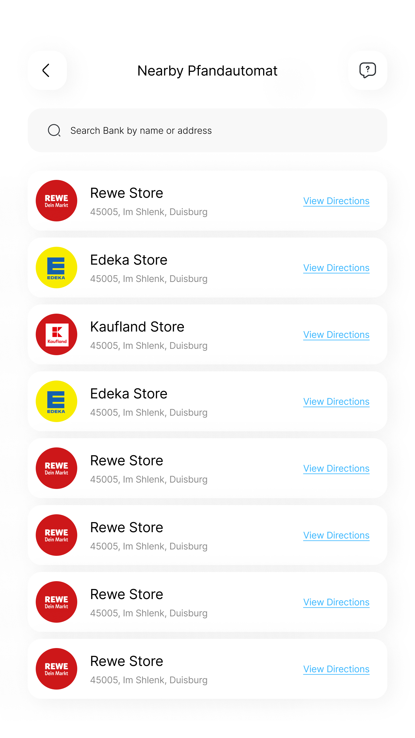
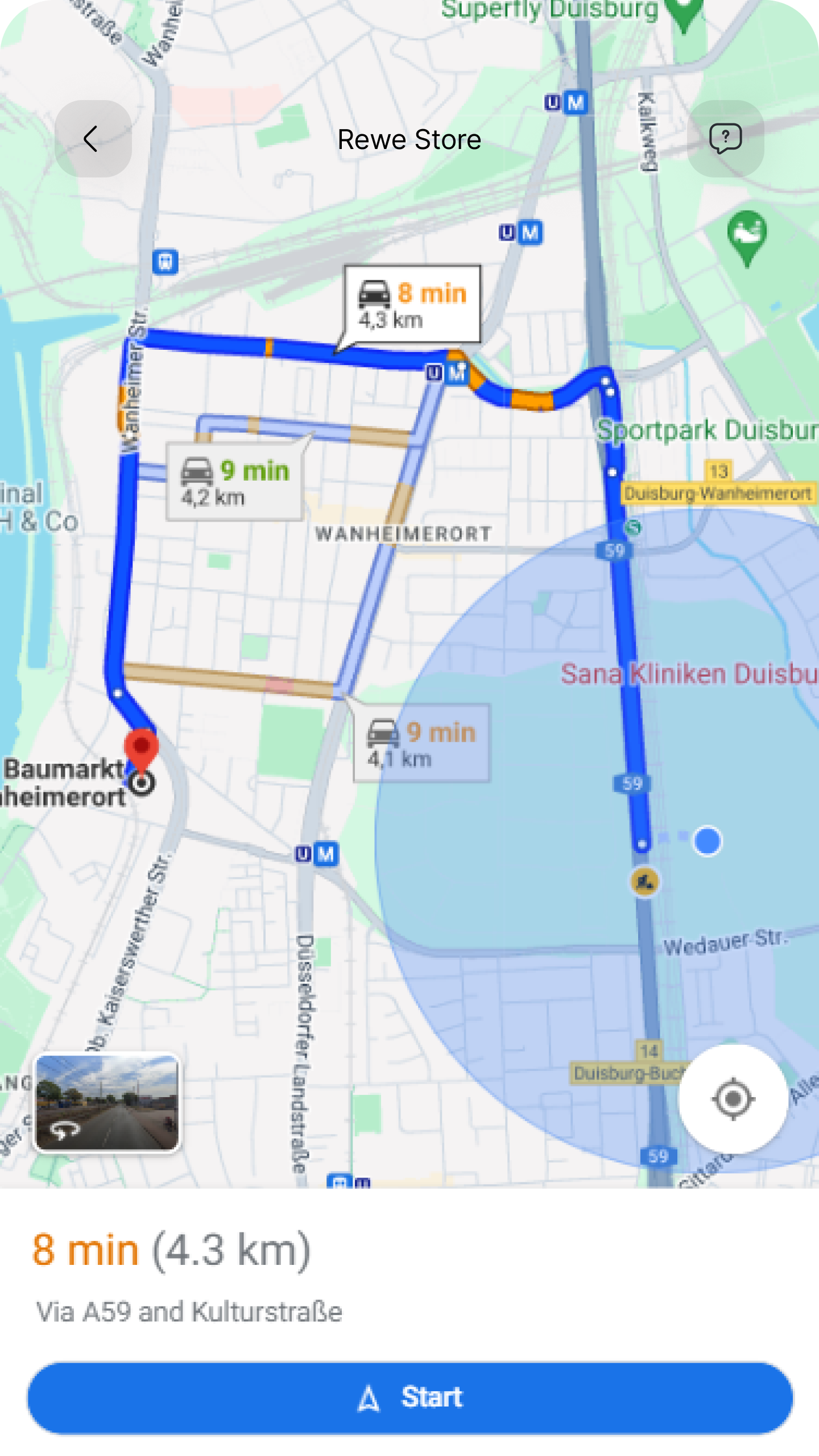
Find nearby machines with real-time availability, helpful for both users and retailers.
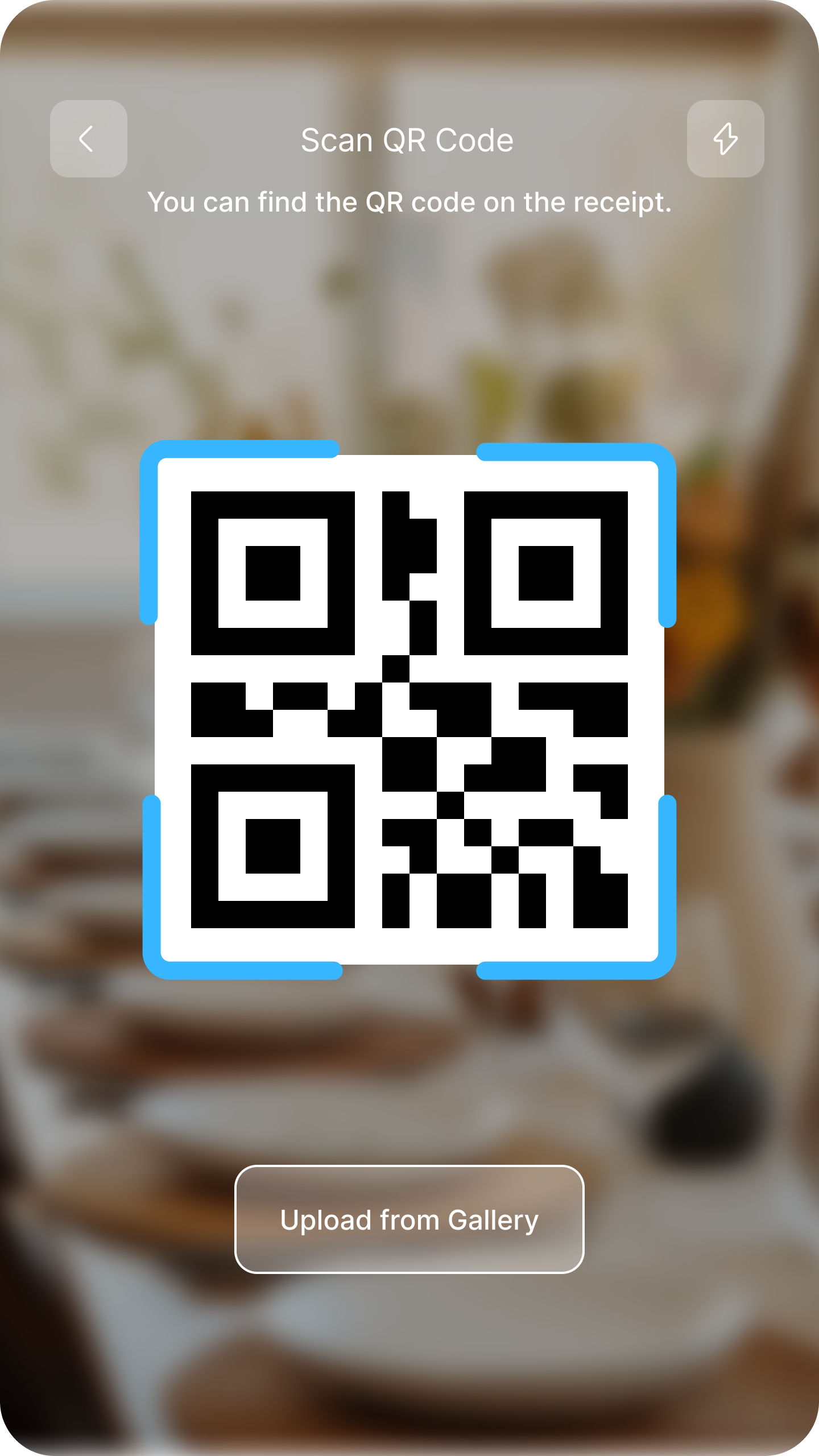
QR scan auto-completes with a receipt summary. Fewer decisions, less cognitive load.
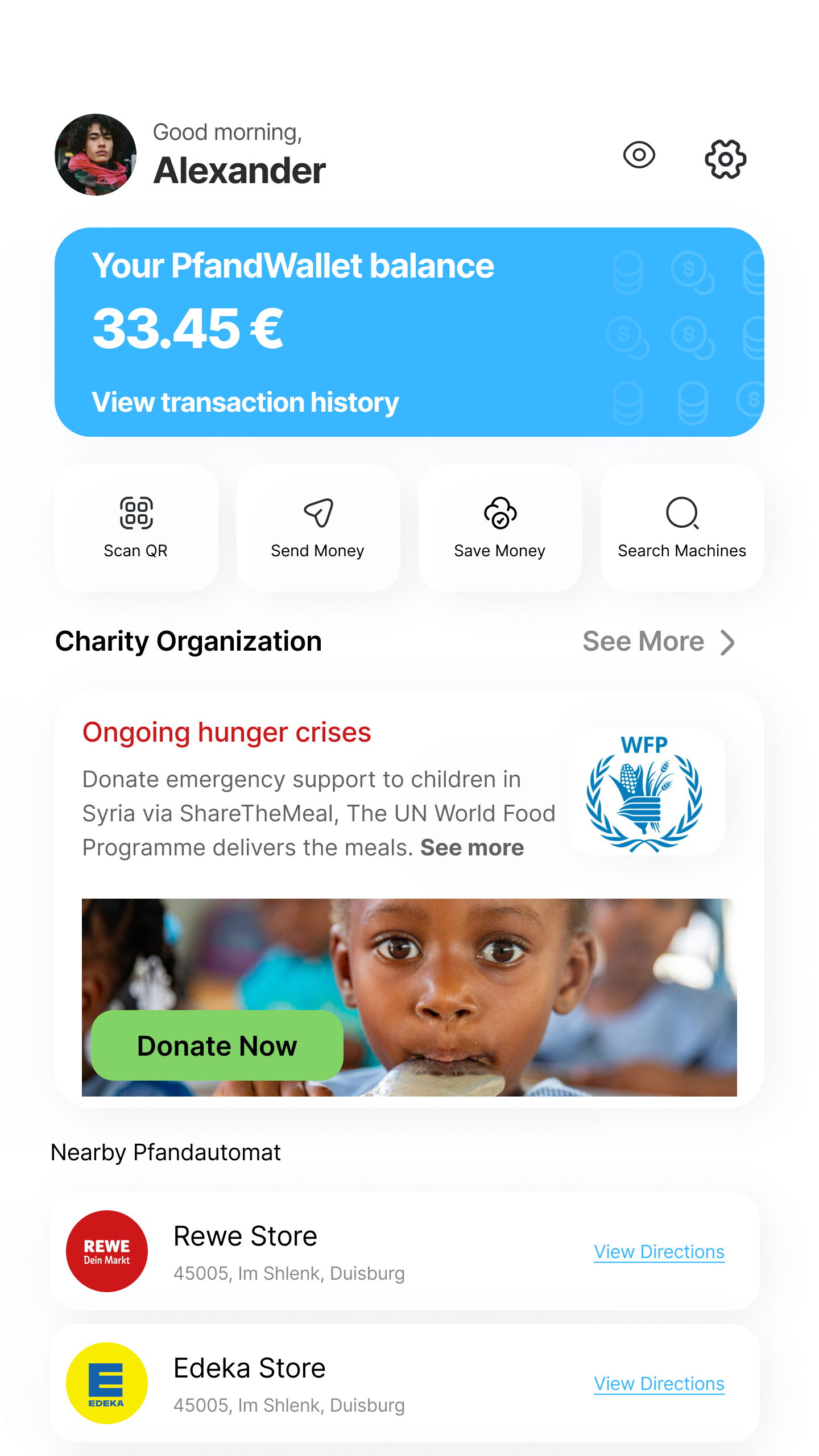
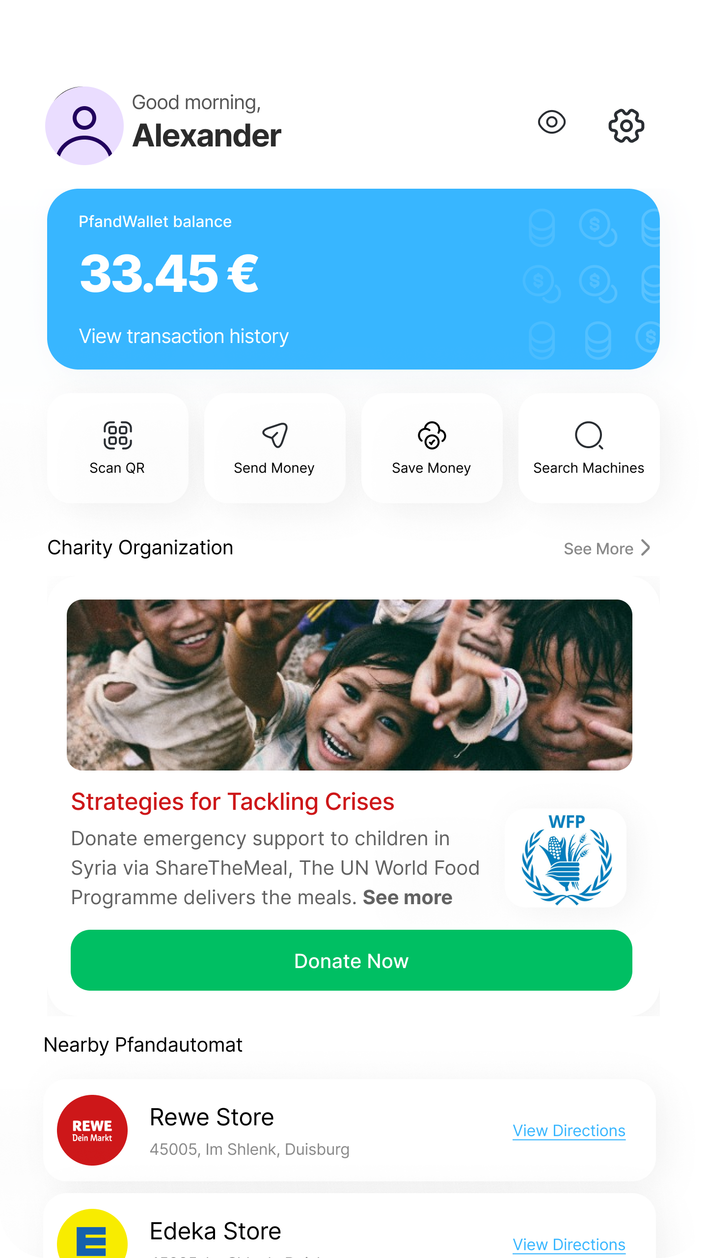
We started with the home page to give users access to all app features.
First Iteration: Replaced the ad-like charity card with a simple detail card that users noticed and trusted.
Second Iteration: Improved clarity and added horizontal scrolling so users could browse faster with fewer taps.
Previous Flow
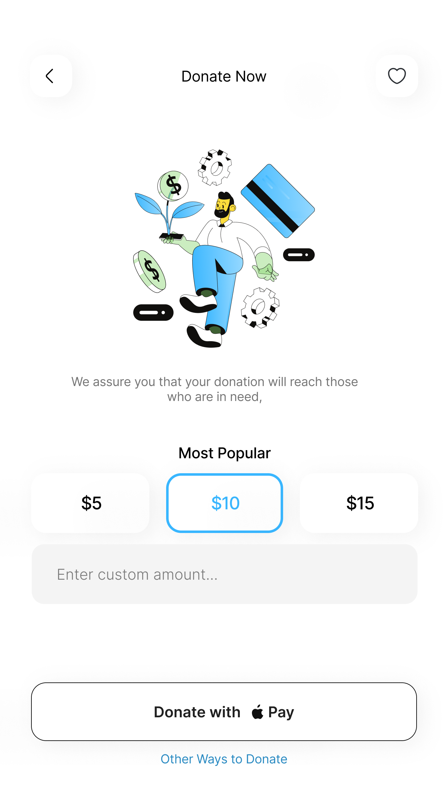
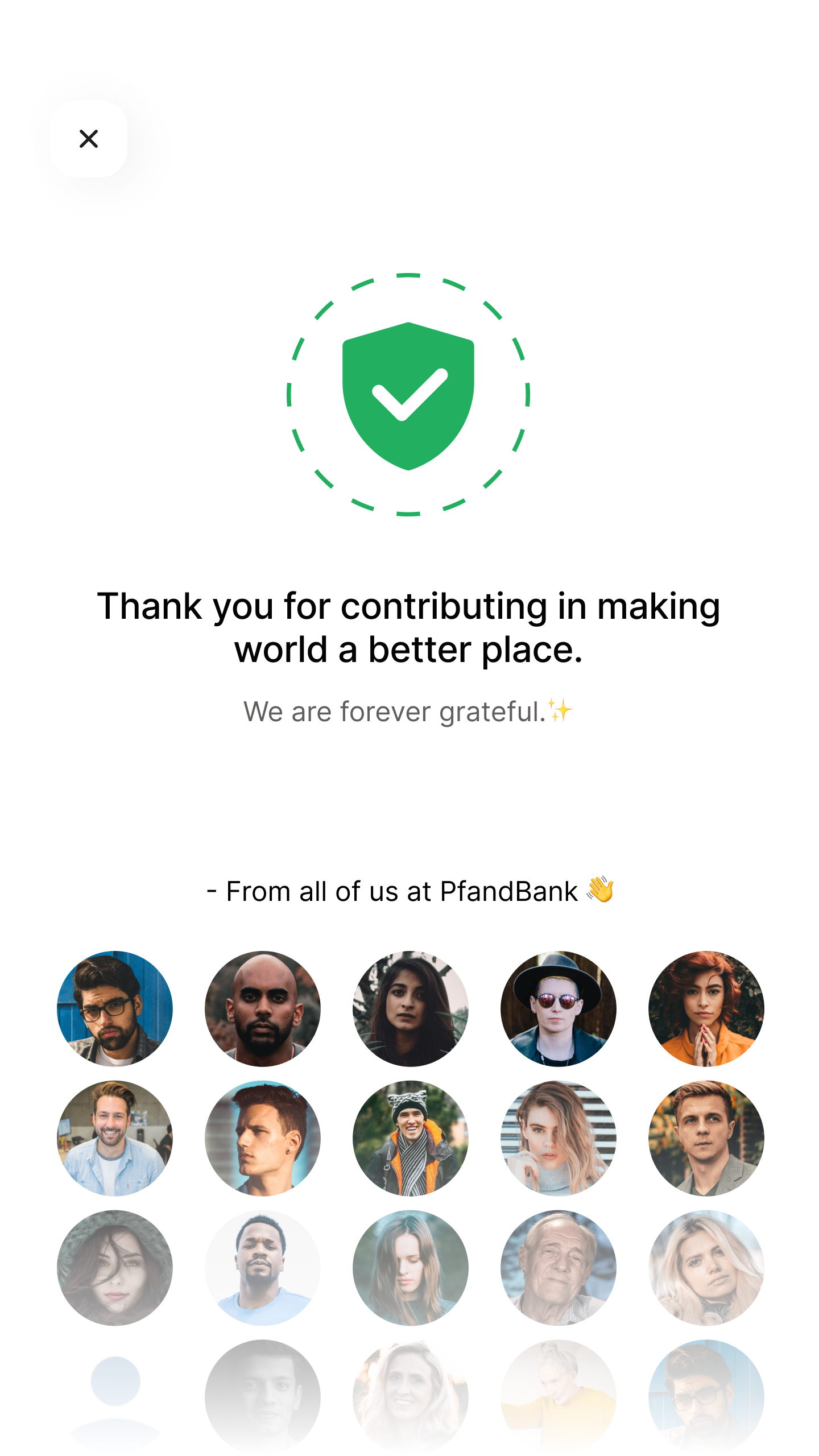
After Iteration
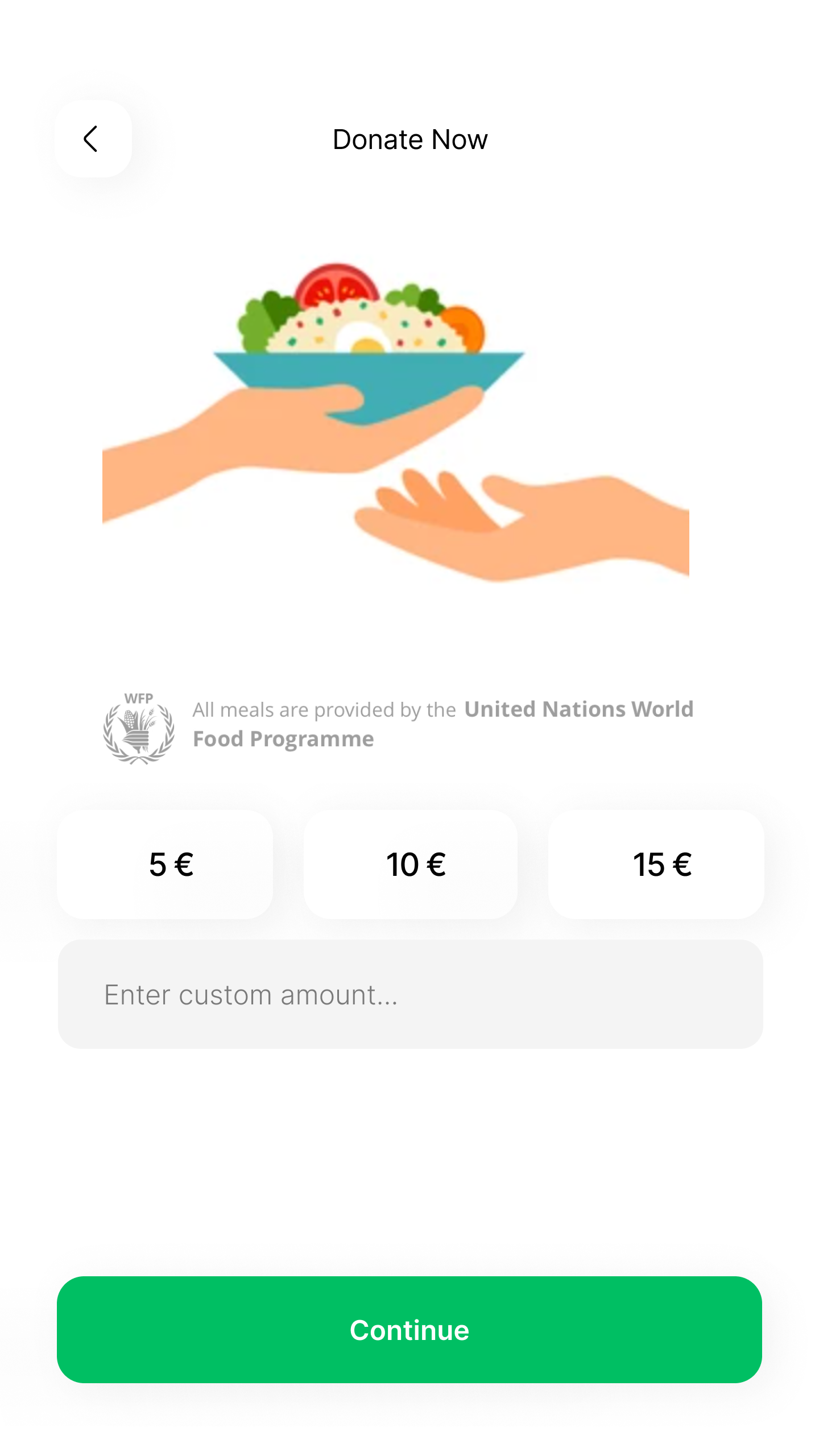
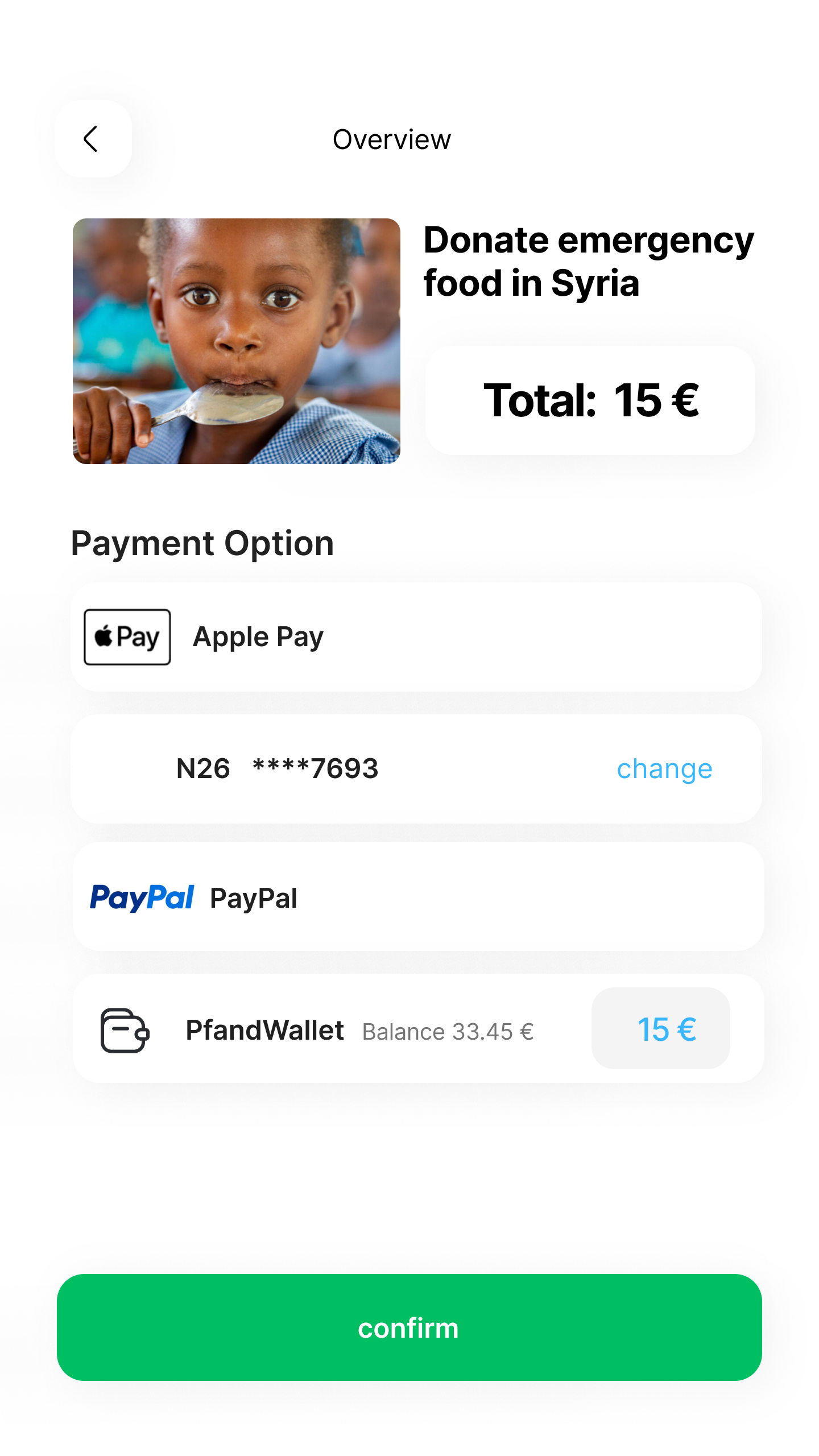
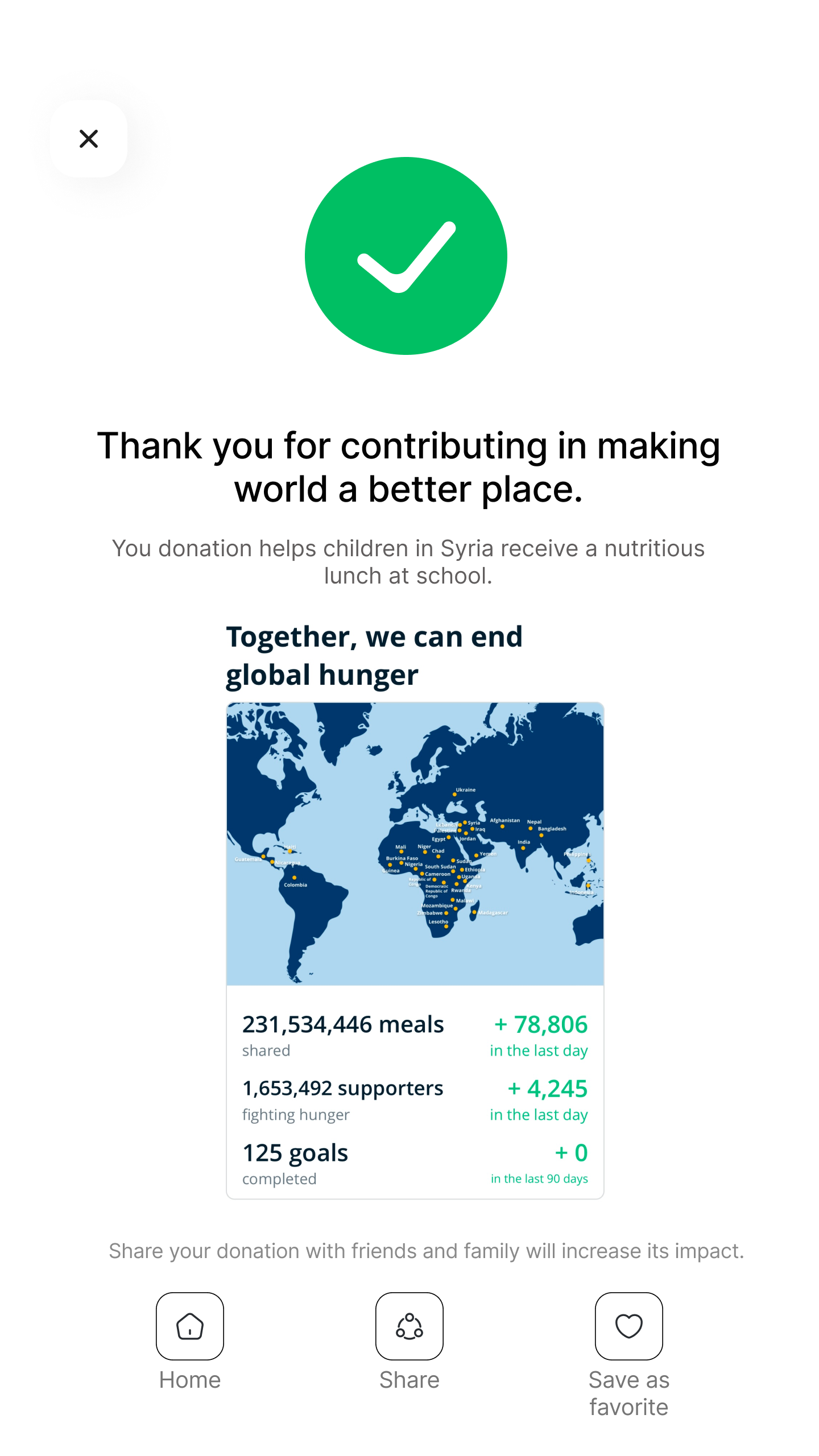
Before: Users picked an amount, saw only Apple Pay, and landed on a success screen. No further engagement.
After: We showed all available payment methods and added social sharing post-donation, giving users control and encouraging a ripple effect.
Previous Flow
Final Iteration
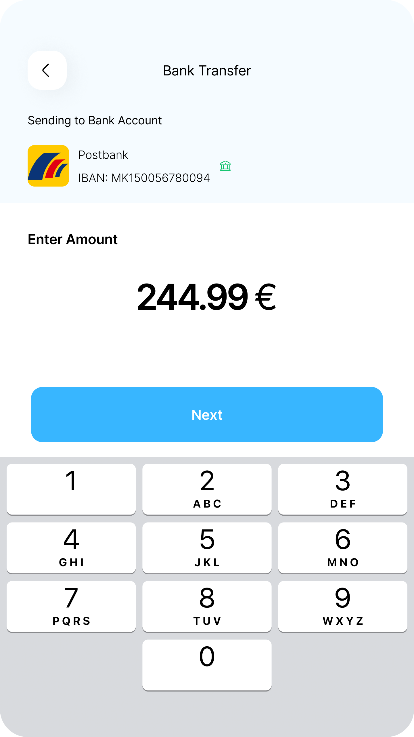
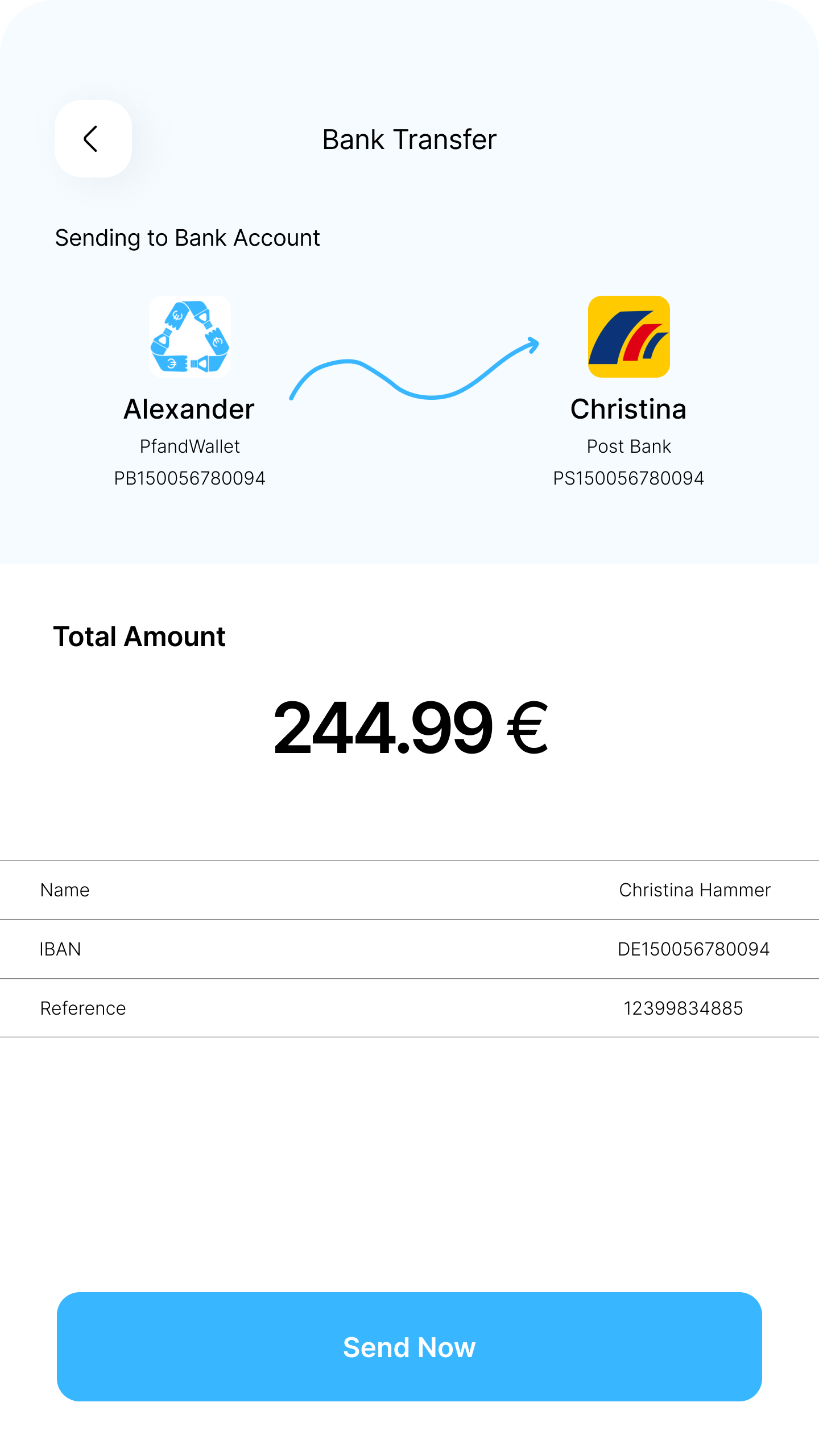
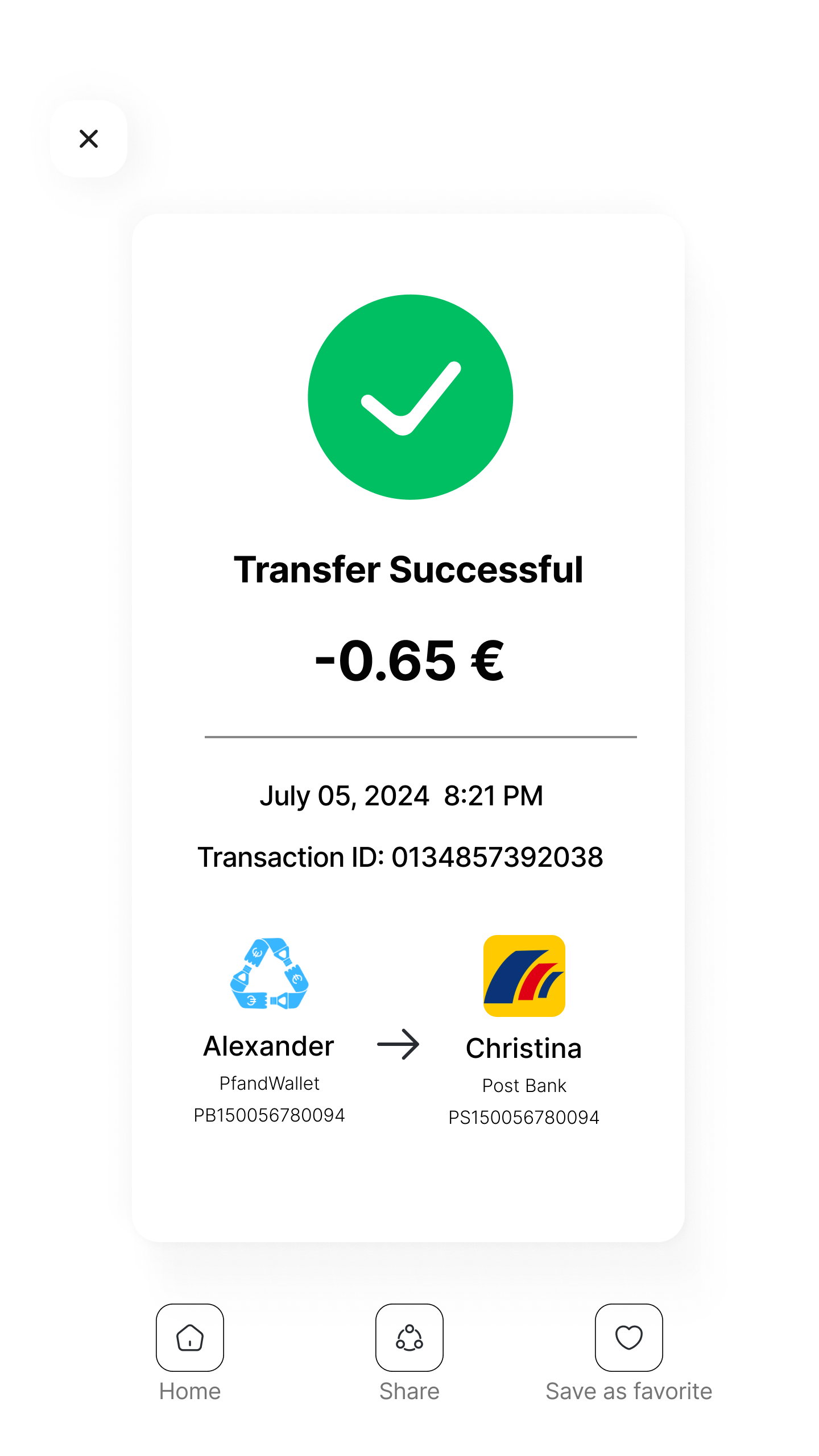
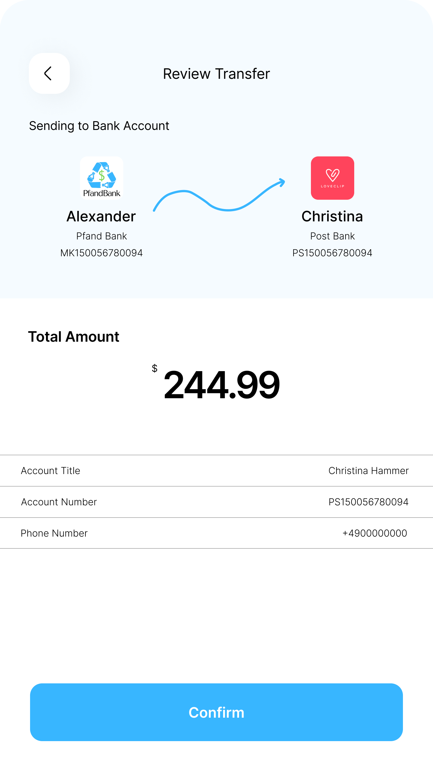
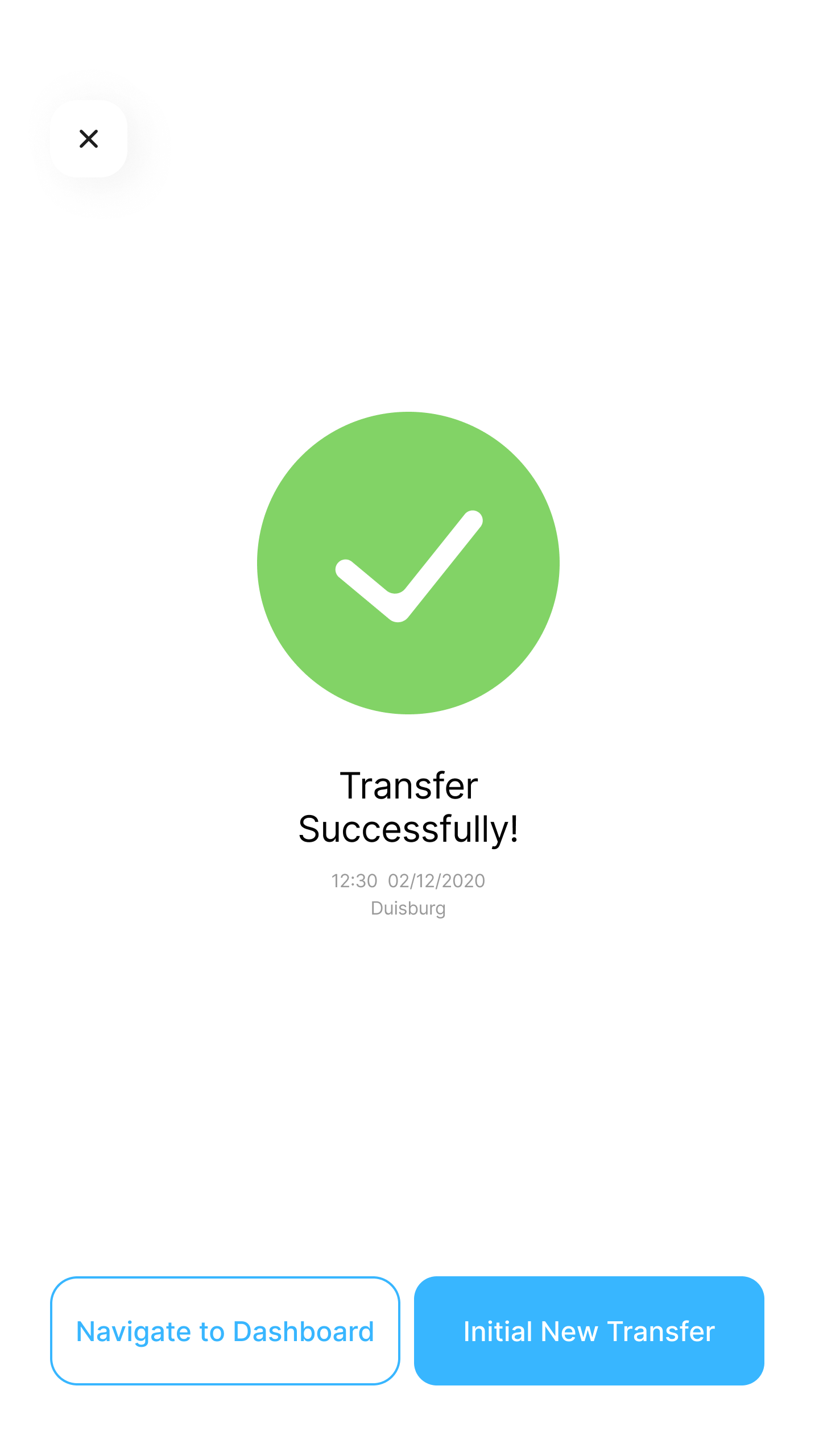
Before: Enter amount, money sent instantly. No confirmation, no verification, no trust.
After: Added a confirmation screen with full details before finalising, plus a share button so users can send the receipt for verification.
Previous Flow
Final Iteration
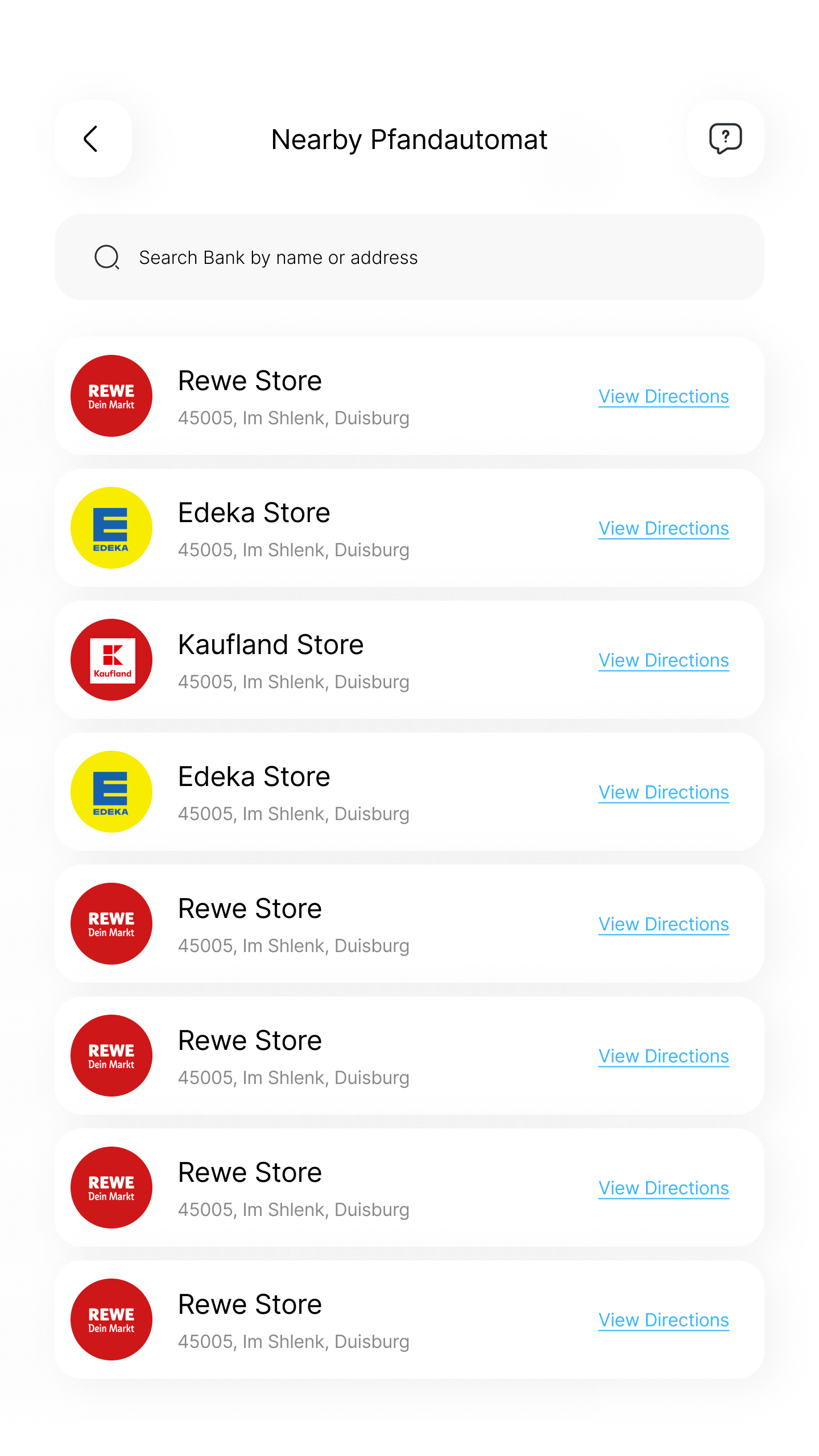
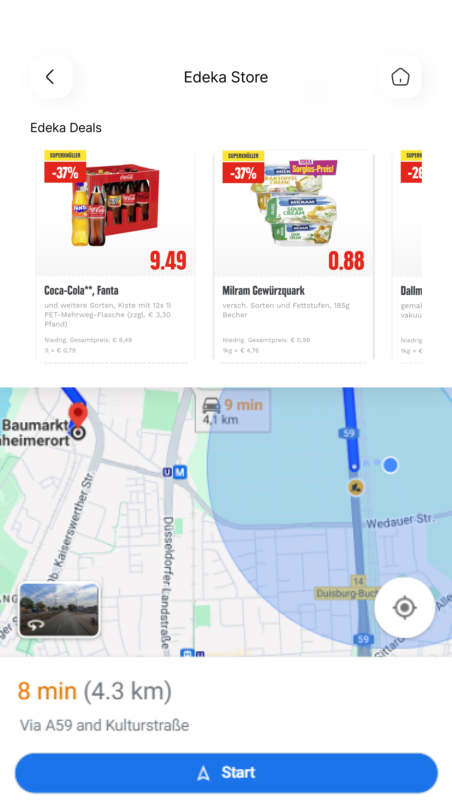
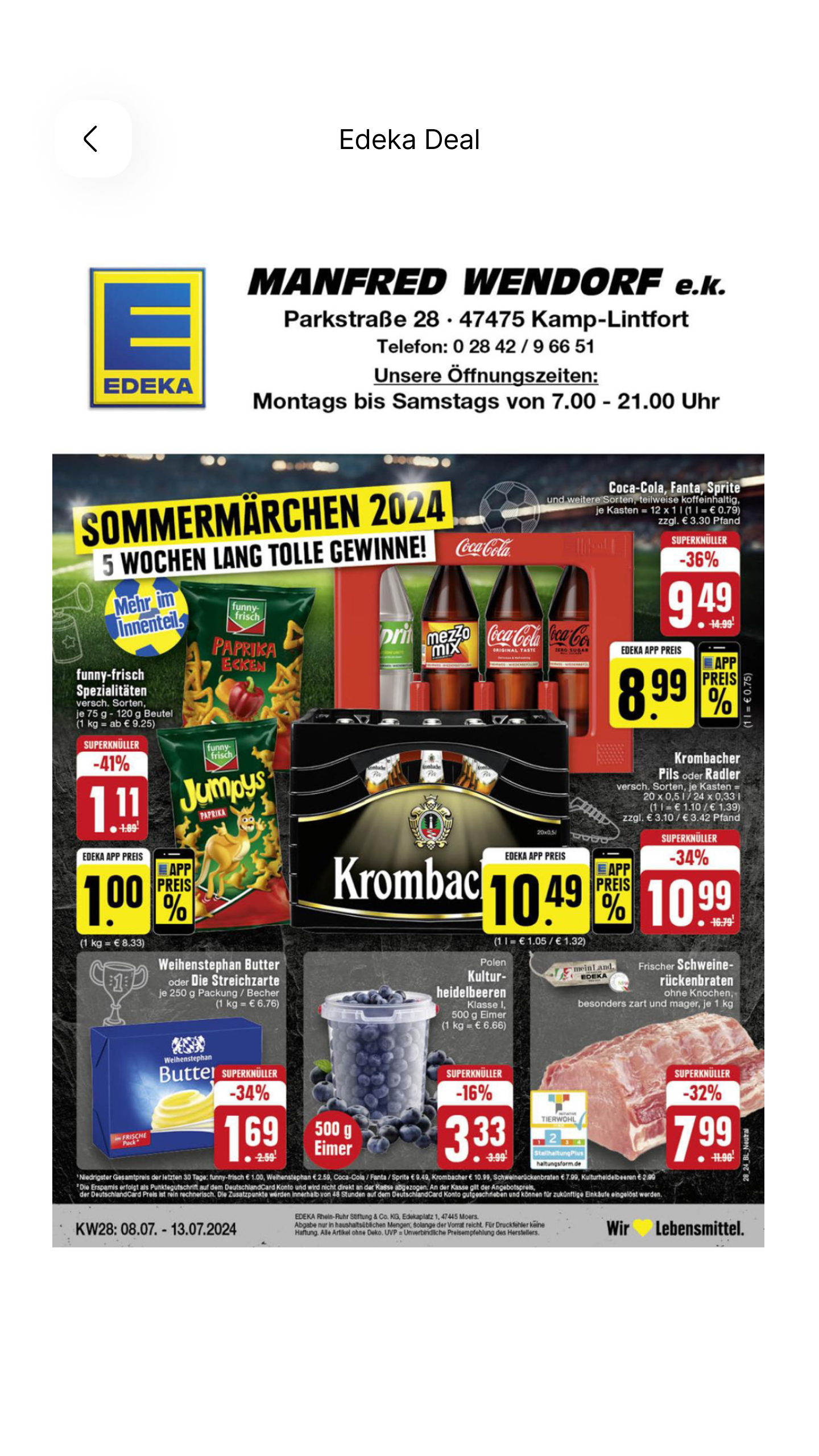
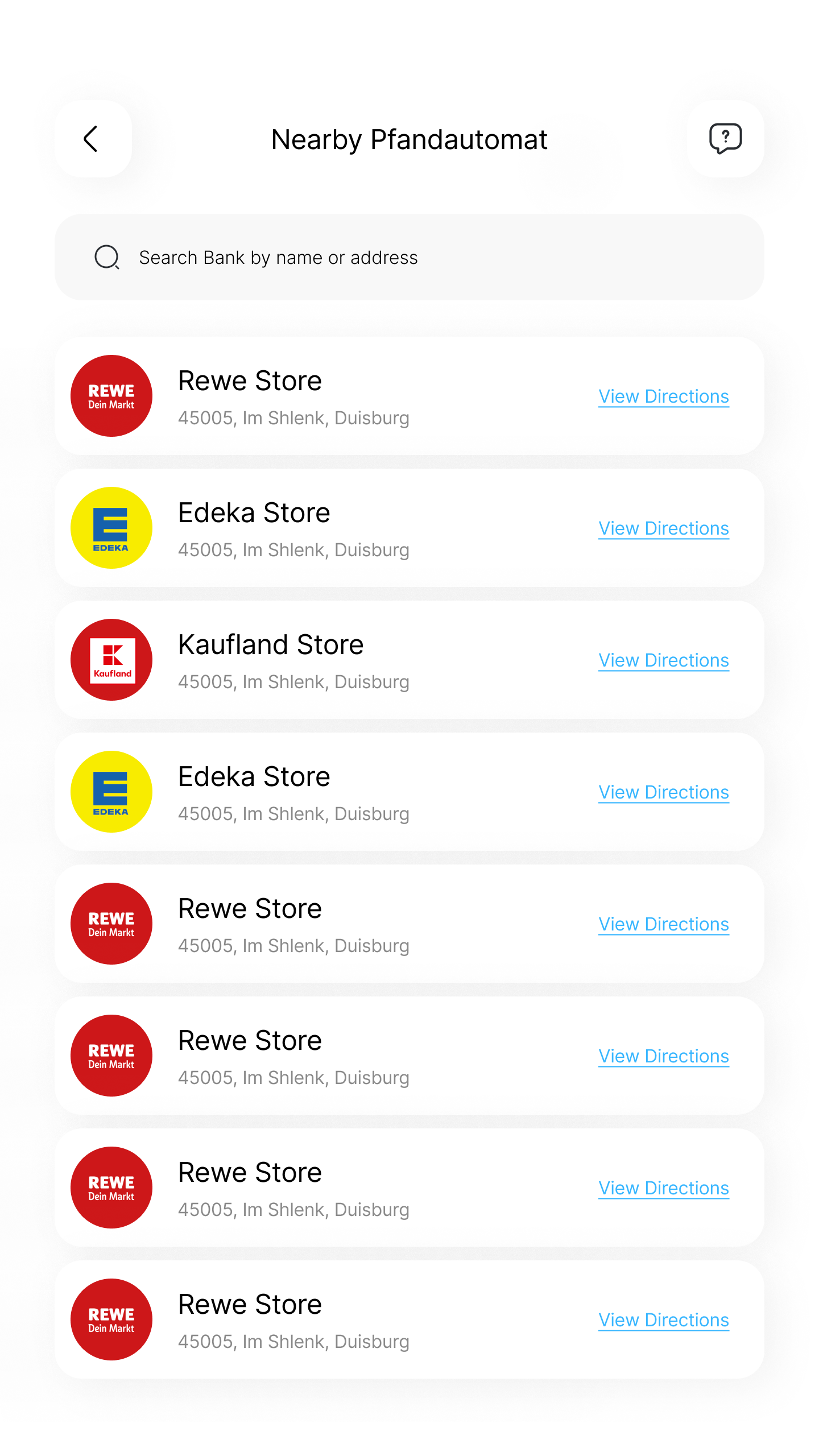
Before: Users saw only the machine location. Nothing extra for the user.
After: Added in-store deals and promotions alongside machine locations, giving users a reason to visit and retailers a way to drive foot traffic.
Represents recycling and money digitisation, the two core values of PfandBank. Multiple iterations for brand clarity.
Blue for trust. Green for sustainability. White for clarity.
Inter typeface. 12-column grid, 24px gutters, 16px margins for consistent spacing.
Click through the live prototype below or open it in Figma for the full experience.
Every feature that resonated came from a validated insight. Assumptions rarely matched what users actually needed.
The most impactful iterations removed steps, not added features. The scan flow proved this beautifully.
Investing time upfront made the hi-fi phase faster and kept visuals consistent without constant rework.