Case Study · Brand & Web
Case Study · Brand & Web
The Brief
My client made handmade herbal soaps. That was it. No brand name, no logo, no website, no way for anyone to find them or buy from them.
The ask was simple on paper: build a premium skincare brand from scratch and get it online. But the real challenge was positioning. The herbal soap space in India is crowded. Most brands look cheap and shout about discounts. Going premium meant every single decision had to earn that price point.
I took on the whole thing. Brand strategy, name, visual identity, copywriting, website design, development, and deployment.
Brand Strategy
Before I touched any visuals, I needed to figure out where this brand actually sits in the market. Most herbal soap brands in India compete on price. That was not the game I wanted to play here.
The opportunity was the opposite direction. A brand that feels like a ritual, not a commodity. Something a customer would gift. Something they would display on their bathroom shelf with pride.
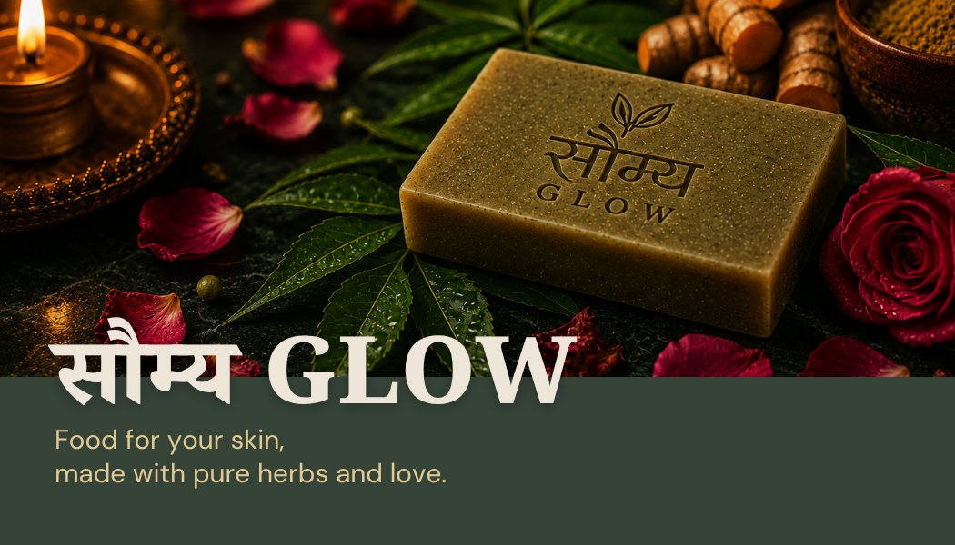
The name came first. I chose Soumya(सौम्य): a Sanskrit word that means gentle, graceful, and pure. It immediately roots the brand in Indian heritage without feeling nostalgic or generic. Add Glow, and you have the functional promise right in the name: visible skin results through natural ingredients.
Then the tagline: Food for your skin, made with pure herbs and love. I wanted it warm enough to feel human, and simple enough to work on a product label, a website hero, and an Instagram caption without losing anything.
Not competing on price. Positioning against premium self-care and gifting brands instead.
Sanskrit name anchors Indian heritage without feeling old-fashioned.
Every decision passed one filter: does this justify a premium price in the customer's mind?
Visual Identity
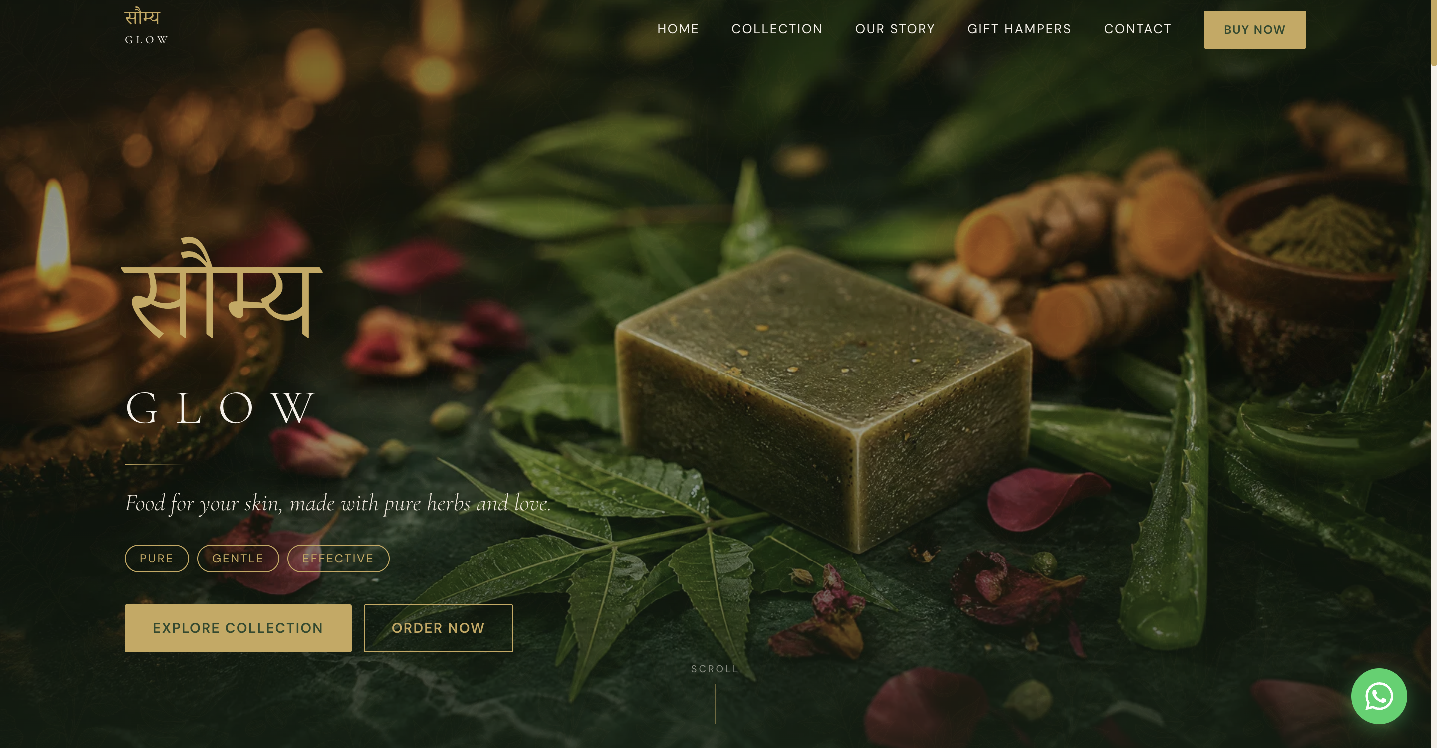
I did not want the brand to look rustic or earthy in a craft-market way. The goal was nature filtered through luxury. Like something you would find in a boutique spa, not a farmers market.
The palette came from that idea. Olive green, sage, sand beige, stone cream, and soft gold as the accent. Nothing bright. Nothing synthetic. Every colour is something you would find in soil or leaves or sunlight through a window.
Typography was a deliberate pairing. Cormorant Garamond for headlines elegant, literary, a little ceremonial. DM Sans for body text clean and modern so it never feels stuffy. And Noto Serif Devanagari for the Sanskrit in the logo, because if you are going to use Sanskrit, honour the script properly.
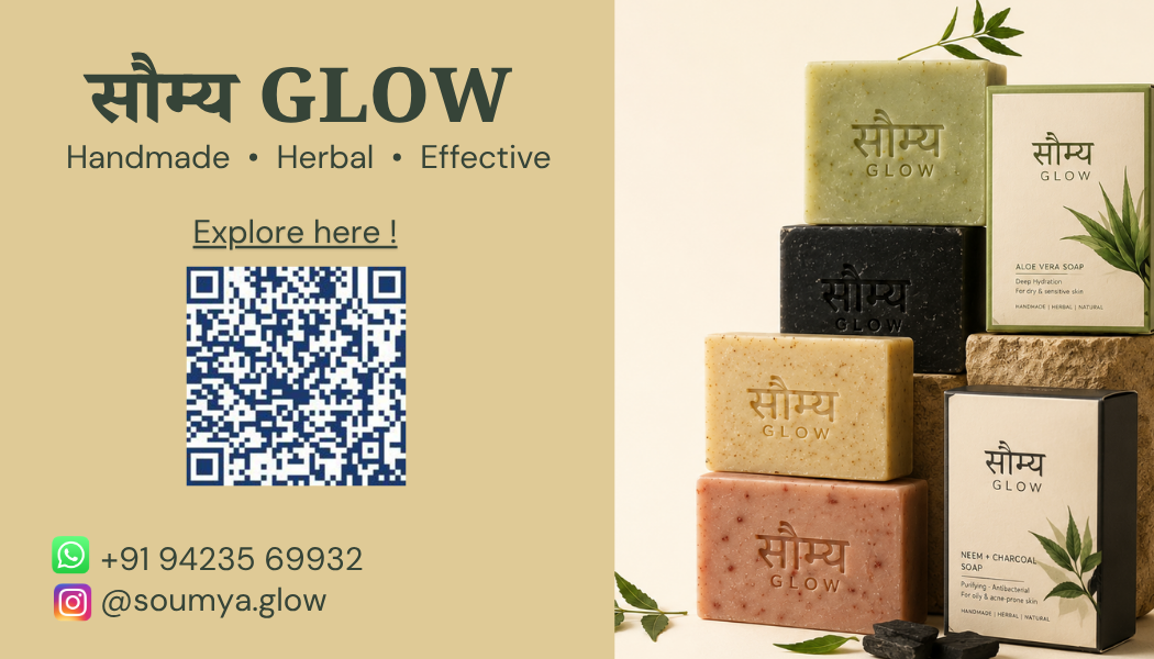
Print Design
The visiting card carries the same visual language as the website — olive, cream, and gold — with the QR code linking directly to the live site, so a physical card becomes a conversion touchpoint.
Front
Back
Web Design · Instagram Identity
The design system had to work in two places at once: a website and Instagram. Same palette, same type logic, same feeling of space and calm. A customer seeing the Instagram post and then landing on the website should feel like they never left.
The Instagram posts below were the first four the brand published. Each one is doing a different job — introducing the brand, showing the product range, storytelling through heritage — but they all feel like they belong together.
 Brand Launch
 Tagline and Benefits
 Full Collection
 Heritage Storytelling
Web Development
I used HTML, CSS, and JavaScript because for a static brand site this size, that is the right tool. Nothing extra unnecessary.
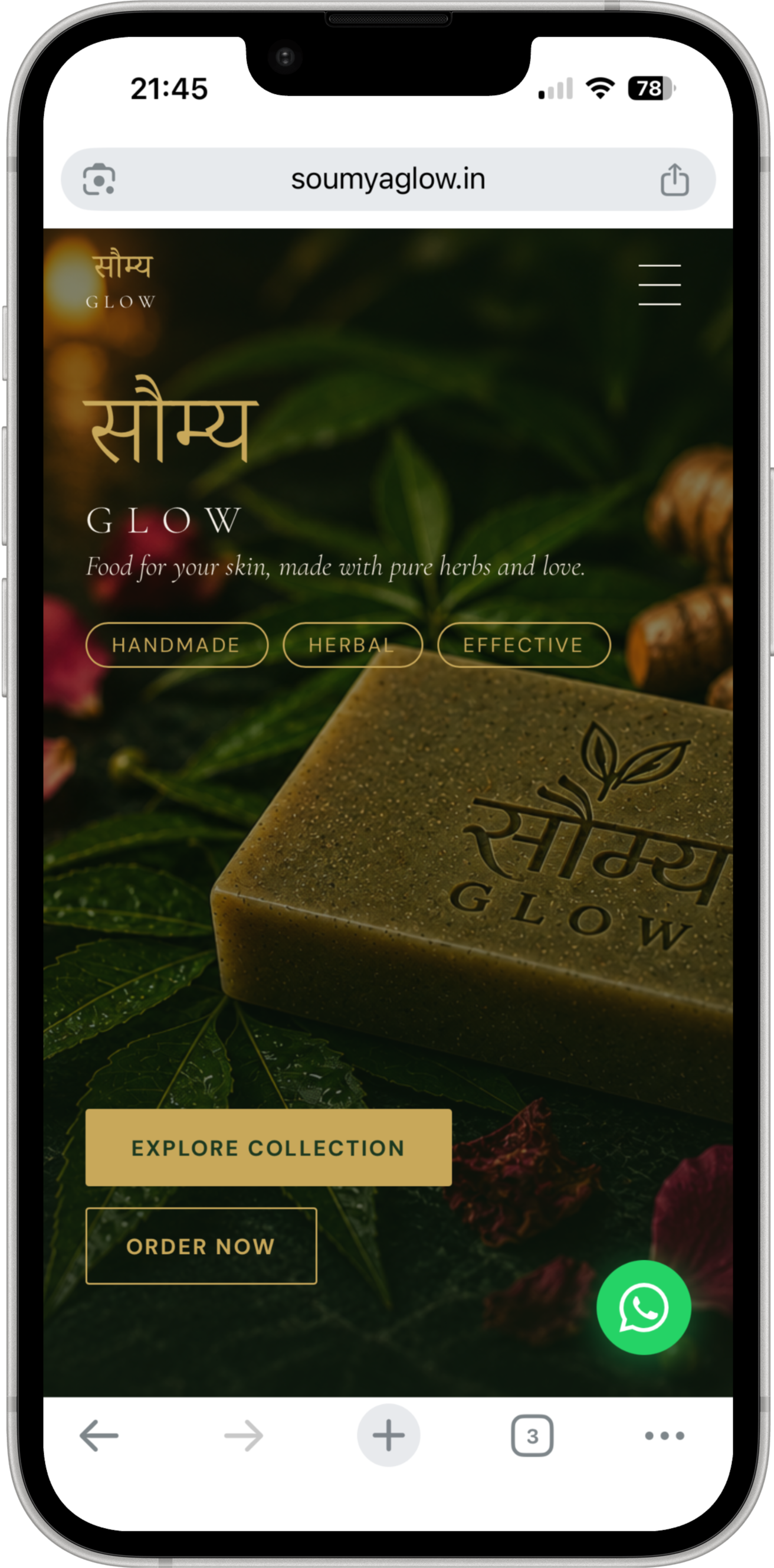
The site is mobile-first. I designed at 430px and scaled up to desktop. Most of this brand's customers are coming from Instagram on their phones — the mobile experience had to be the priority, not an afterthought.
Animated hero with left-aligned typography and a dark radial overlay for contrast.
Horizontal scroll soap collection with 3D image spill-over effect on each card.
Scroll-triggered reveal animations using Intersection Observer — no library needed.
WhatsApp chat-style testimonial bubbles and a gift hamper section with four tiers.
Hosted on GitHub Pages with a custom domain through GoDaddy. Live at soumyaglow.in.
Conversion Design
This was the most important decision on the project. And it was not a visual one.
A traditional cart would have meant payment gateway integration, backend infrastructure, and weeks of additional build time — for a brand that had not yet proven demand. More importantly, the target customer was already buying through WhatsApp. That is how direct-to-consumer skincare moves in India right now.
So I replaced the cart entirely. One tap on any product card opens a pre-filled WhatsApp message with the product name. The customer is in conversation with the brand in under three seconds. No account creation, no checkout flow, no friction.
This was a funnel decision. I looked at where the drop-off would happen and designed around the behaviour that already existed.
That kind of thinking matching the purchase path to how people actually buy, not how a textbook says e-commerce should work — is what made the conversion flow feel natural instead of forced.
Live Project