Case Study · 2026
Cottbus, Germany
Clay Oven
by Sharma
A restaurant website designed for two audiences at once, German and Indian. Bringing both cultures together and balancing impressions.
View Live Site ↗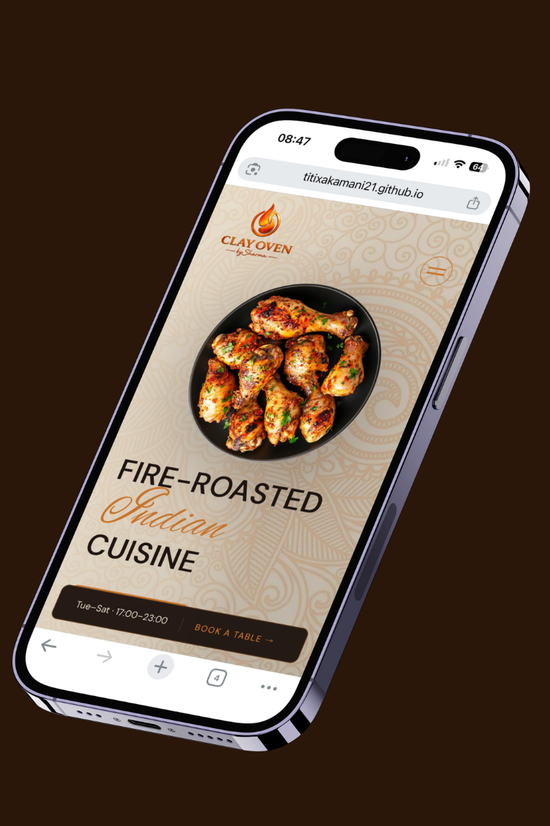
A restaurant website designed for two audiences at once, German and Indian. Bringing both cultures together and balancing impressions.
View Live Site ↗
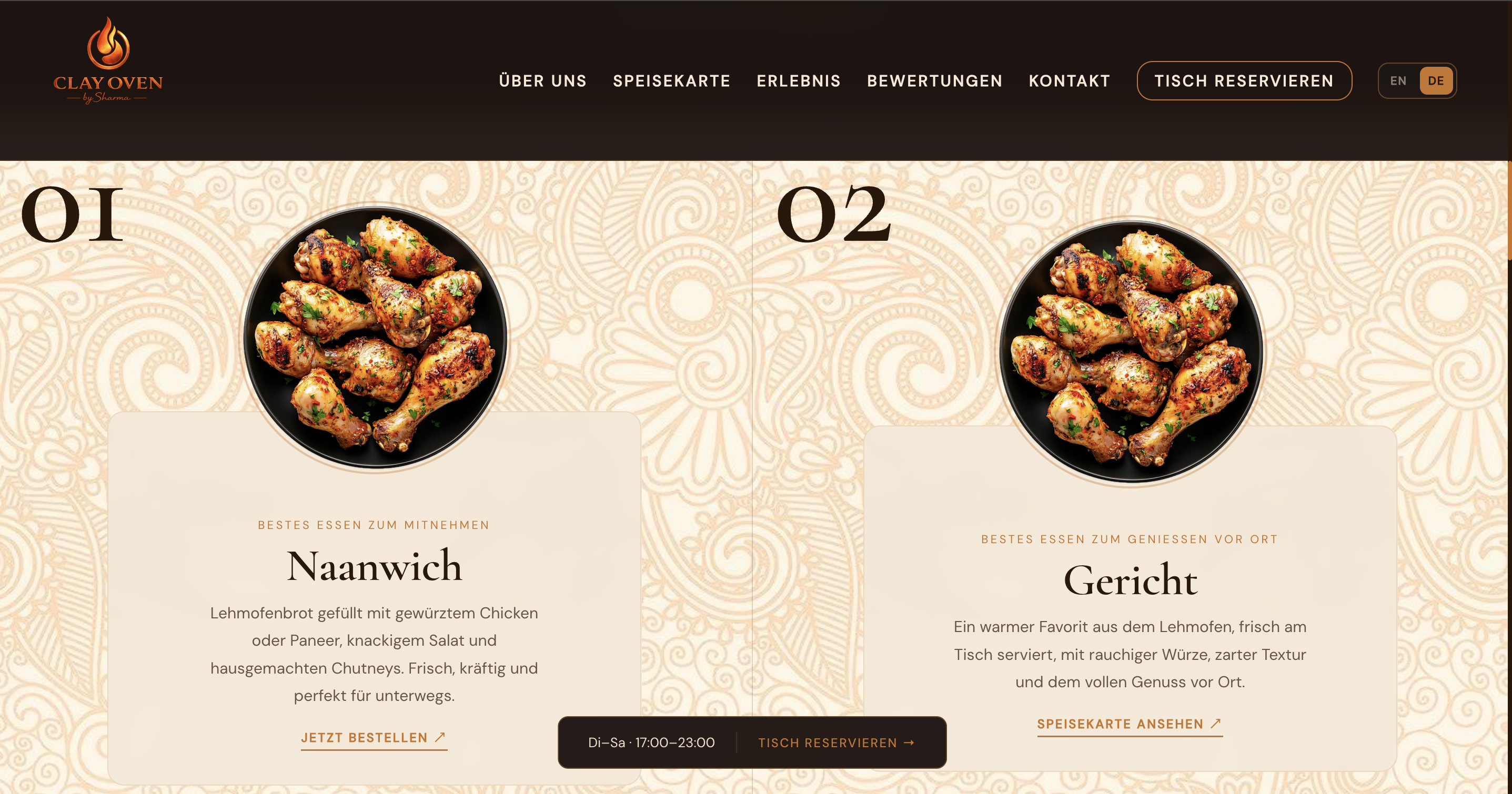
The client told me from day one that two completely different groups of people walk through the door. Indian families looking for familiar warmth and flavours they grew up with. German locals curious about something new, looking for trust and clarity before they commit to a reservation.
That is a real tension in design. What reads as warm and inviting to one audience can feel busy and unclear to the other. What feels clean and minimal to a German eye can feel cold and uninviting to an Indian one.
My job was to find the version of this site that works for both at the same time, without compromising either.
Copper as the primary accent sits at exactly the right point between the two cultures. Rich enough to feel Indian. Refined enough to feel European. Cormorant Garamond as the display font carries editorial weight that reads as premium in both contexts.
The bilingual toggle was built into the HTML from the start, using data attributes on every element. Switching languages takes zero page reloads and keeps the user exactly where they are on the page.
Here is every direction I explored for the dishes section and exactly why each one got cut.